The Edition System: A Manifesto Against Templates
A template is a guess at universality. An Edition is a commitment to specificity. The world has enough guesses. Why naming a design system is the move that lets it survive its creator.
The design industry simultaneously sells two opposite products and pretends they are different points on the same spectrum. They are not.
On one end: templates. Cheap, replaceable, anonymous. Sold by marketplaces, consumed at scale, identified primarily by the absence of identity. A template's job is to be invisible. It succeeds by not being noticed.
On the other end: bespoke design. Expensive, custom, undocumentable. Sold by studios, consumed by clients who can afford the privilege of specificity. A bespoke project's job is to be unmistakable. It succeeds by being entirely itself.
Both fail.
Templates fail because they cannot carry brand specificity — the moment a brand grows past starter scale, the template becomes an active liability. Bespoke fails because it cannot be inherited, scaled, or defended without the original designer in the room. The brand drifts the moment the designer leaves.
The Edition System is the third option. Constrained, named, productized — but not template. This essay is about why that distinction matters, and why naming a design system is the move that lets it survive its creator.
The History of the Failure
Why design systems as a movement — Material Design, IBM Carbon, Shopify Polaris — succeeded for product UI but failed for brand expression.
The reason is in the optimization function. These systems optimized for consistency. Consistency is the right metric for product UI: users should not have to relearn how a button works between screens. But consistency is the wrong metric for brand expression. A brand that is merely consistent has no signature. It is a brand that survives but does not get remembered.
Massimo Vignelli understood this. In The Vignelli Canon, he argued that constraint is not the enemy of character — it is the prerequisite for it. A typeface chosen from a library of three is a decision. A typeface chosen from a library of three thousand is a guess. The discipline of constraint is what allows character to emerge, because every element inside the constraint is a deliberate act, not a default.
The Edition System inverts this. It does not eliminate decisions — it fixes the decisions that don't matter so that the decisions that do can be made with full attention. Palette is locked. Typography pairing is locked. Layout logic is locked. What is unlocked is the work itself.
This is consistency in service of character — the opposite of consistency as a substitute for it.
The Edition Thesis
An Edition is:
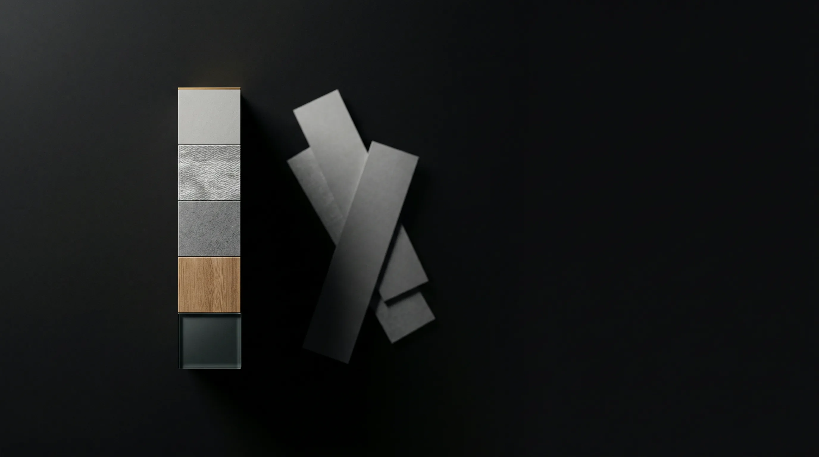
- A locked palette — non-negotiable, including not only primary brand color but every neutral, every accent, every shade of gray. The palette is a contract.
- A locked typography pairing — non-negotiable, with display and body fonts named, weights specified, scale ratio calculated. The typography is a fingerprint.
- A locked spatial logic — non-negotiable spacing rhythm, grid system, light/dark surface rules. The spatial logic is the silence between elements, and silence is part of the music.
- A named identity — non-negotiable name with semantic meaning. RED commands. CONCRETE measures. VELVET feels. VOID refuses. STELLAR moves.
Inside those four constraints, infinite expression. Outside them, refusal.
A copywriter working in RED Edition cannot accidentally make the brand feel like CONCRETE. The system will not allow it. The Big Shoulders Display 900 will not become Azeret Mono. The warm near-black surface will not become cool graphite. The constraint is institutional, not personal — which means it survives turnover, scales across freelancers, and defends itself in meetings.
ALO ships five Editions:
- RED — Atelier. Big Shoulders Display 900. Warm near-black surface. Command the room. For solo founders and brand designers who need commanding presence.
- CONCRETE — Grid. Azeret Mono 600. Cool graphite surface. Built to scale. For systems thinkers and engineers who respect visible structure.
- VELVET — Depth. Playfair Display 700. Warm cream surface. Feel everything. For creative directors who design immersive experiences.
- VOID — Manifesto. Spectral 200 italic. Absolute black surface. Nothing more. For minimalist architects who believe type is the interface.
- STELLAR — Kinetic. Archivo 900 uppercase. Night-blue surface, electric cyan. Move now. For fitness, sport, performance, and events brands built on momentum.
Each Edition is sold as a one-time productized object — not a subscription, not a template marketplace download. It is a published work. You acquire it, you own it, you build with it.
Why Naming Matters
A nameless aesthetic cannot be defended in a meeting.
"It looks better" loses to "the data says move the button." It loses every time. Aesthetic preferences without names are not arguments — they are taste, and taste is the first thing a stakeholder pushes back against.
But "this is RED — we don't put cool tones in RED" wins, because the constraint is institutional. The named system carries authority that the individual designer cannot. The designer is no longer defending a personal preference. The designer is defending the system.
This is why naming is not branding decoration. Naming is the mechanism by which a design system becomes defensible.
What is named can be defended. What is defended can be inherited. This is how studios become firms.
The Inheritance Argument
The hardest problem in design is succession.
Who takes over the brand when the designer leaves? Most brands answer "no one" — and watch the brand drift within twelve months. The designer's taste was the system. The taste left with the designer. What remains is a Figma file no one knows how to operate.
Editions solve this. The system survives the designer.
A new designer hired into a RED Edition brand inherits the constraints, not the previous designer's preferences. They do not have to recreate the founder's taste. They have to operate inside the named system. The brand becomes legible to anyone willing to learn the system — which means the brand can scale beyond its original creator.
This is the difference between a studio and a firm. Studios end with their founders. Firms outlast them. Naming the system is the first move that makes the latter possible.
Close
A template is a guess at universality. An Edition is a commitment to specificity. The world has enough guesses.
The studios that will matter in the next decade are the ones building systems with character — named, constrained, productized, defendable. They will not look like template marketplaces, and they will not look like bespoke ateliers. They will look like publishers — releasing curated objects, on a schedule, under a coherent editorial discipline.
That is the discipline ALO Design Pros practices.